Art and Design Portfolio
Computer Science Major and Art and Design Minor undergraduate student based in Raleigh, NC. Focused on applying 2 Dimensional design principles to create dynamic and visually intriguing concepts.
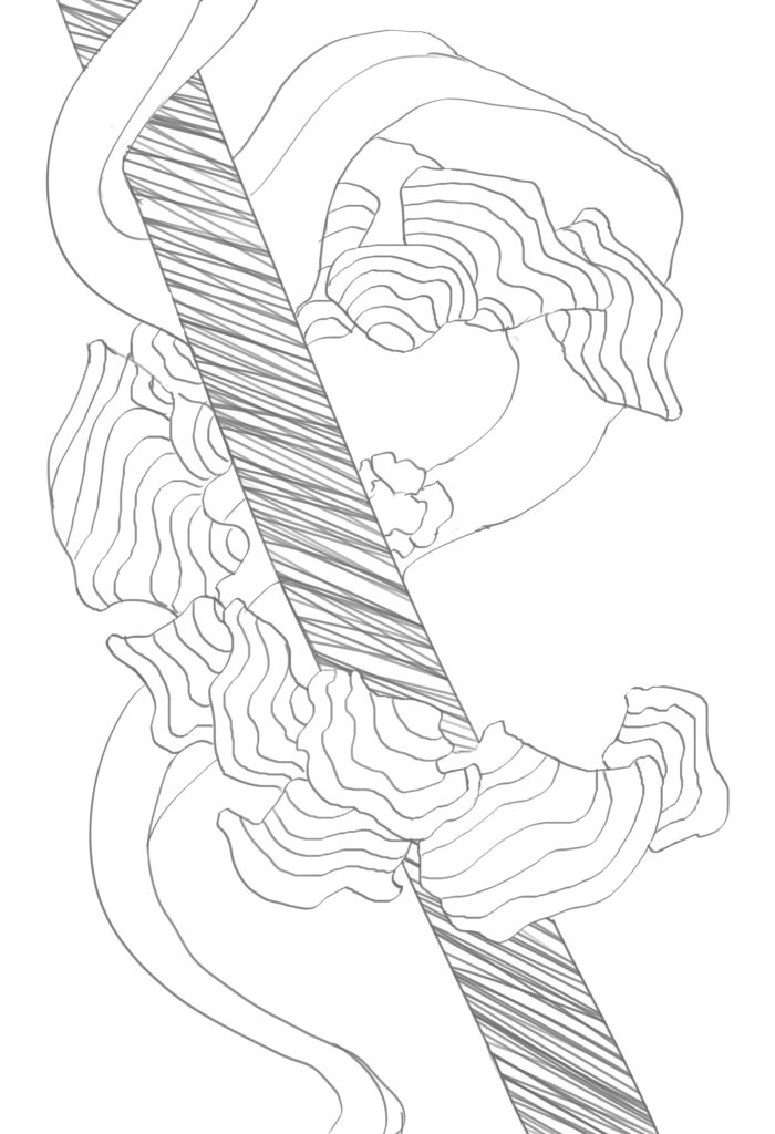
Assignment 2: Composing with Thin Black Lines
With restrictions on the kinds of lines we could use for this assignment, I decided to prioritize layering, shapes, and patterns to give the composition more depth. A more organic center radial pattern was the centerpiece for this composition, contrasted with a rigid structure passing through it. A ribbon-like shape was then used to allow for more dynamic flow through the composition and as a balance to the straight lines of the bar.
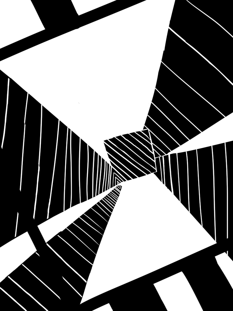
Assignment 3: Composing with Thick Black Lines
Moving away from thinner lines, using only thick black lines allowed for more experimenting with positive and negative space. Using variably thick lines, I created a vanishing point that lead to a center pattern. I then used a thick black frame to give the vanishing point more depth, as if you can see it though a framed picture or window. This helped with the illusion of depth.
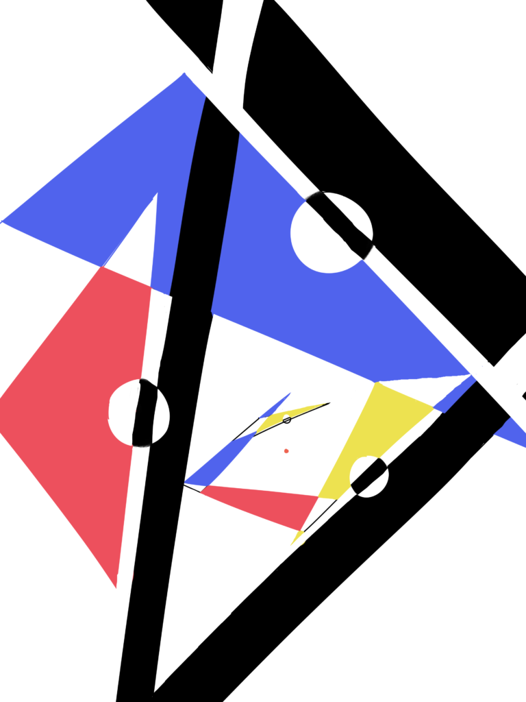
Assignment 4: Composing with Straight Black Lines and Color Planes
As the first assignment to introduce posibilities of base colors, I wanted to stress the contrast of positive and negative space even further. Using gemoetrical shapes as planes. Using the same vanishing point concept as assignment 3, a geometrical pattern sprials using black thick lines as a backing.
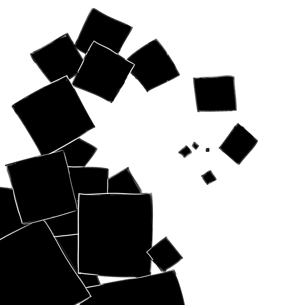
Assignment 5: Composing with Black Squares
With a focus on more geometrical shapes, I wanted to embrace a sort of inorganic structure to build tension and using shapes to convey a sort of spiral pattern. I used the golden ratio to inspire the shape of the spiral.
Assignment 6: Figure and Ground Composition
Figure and ground composition was one of the bigger steps away from lines, and I wanted to focus even more on positive/negative space as well as shillhouttes to form ideas. The idea of an inversed street lamp to convey isolation was the main pull for this composition.

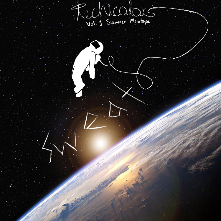
Assignment 7: Record Album Cover
In this assignment, I redesigned the album cover for SWEAT by the technicolors. Using ideas of space to focus on being isolated and aimlessly floating, I used positive negative coloring on the astronaut to convey being out of touch with the universe. This sense of scale in comparison to the world in the background worked to make the viewer feel smaller.
Aidan Nelson
Proudly powered by WordPress
